Tuesday, August 31, 2010

So I'm super excited because today at 11:30 I am meeting with a landscaper to discuss my front yard!  We bought our home two years ago and have been making improvements since, but the poor yard has gotten zero attention.  This is the day we bought it...


It's very traditional and I think the front yard should be as well.  Our house faces west so we need landscaping that can withstand the boiling afternoon summer sun.   Here's another shot...


I really do not have any ideas or requirements so I can't wait to see what he suggests!

If this was my forever home I would so extend my little stoop into something like this...


but it's not so I have to concentrate on making smaller improvements:)  I plan on taking the storm door off and painting the door a lighter color.  Bryn Alexandra posted this exterior makover on her blog...
before


and after...doesn't it looks great without the storm door and new light fixtures?!?


Speaking of new light fixtures...I'm thinking these...long and skinny shoulf fit the space nicely.  I'm taking pictures to show the landscaper.


And since we are talking about exteriors...I think this is the cutest house...love it!


Wish me luck!
~the blonde

Monday, August 30, 2010

{red carpet review}: the emmy's

The Emmy red carpet was full of great fashion last night.  It seems like many of tv's fashion darlings were absent, but the ones that were there did not disappoint. 

Let's start with the sparkle...
Last night was obviously Claire Daines' night and she looked radiant in this solid blush sequined Armani Prive gown...love her loose hair and minimal accessories!  Claire is tied for the brunette's best dressed of the night!  


Navy was also a prominent trend for the night...


and while all these ladies looked stunning, Lea Michele took the prize.  She was definitely one of the best dressed of the night!  Loved, loved, loved her necklace...I think that's what made the look!


Several ladies shined in white...
I think Brooke looked the best...very classic and I also loved Rose's Gucci dress. 


The best of the black...
Eva always looks like a movie star, Kelly looked great and Heidi's entire look was amazing.  I don't know if Heidi was completely Emmy appropriate, but wow, just look at her! 


The blonde loved Anna in her little black dress with heavy gold embellishment, but the brunette was not a fan.  The dress did look much better on television than in these pictures.  Anna is a huge McQueen fan and I loved seeing her in this dress! 


I don't watch Vampire Dairies and have never heard of this girl, but holy cannoli...she is stunning in this Zuhair Murad nude gown.
.

Speaking of nude, Maricka Hargitay looked so pretty presenting last night in this Vera Wang...loved the little sheer ruffle on the top!


These girls brought the color!
Keri looked precious in her vintage, but also a little too casual.  Isn't the color of Emily's Max Azria Atelier gown gorgeous?!?


And since we are talking color then it's time to discuss Januray Jones' Armani gown. 
I (the blonde) am a huge fan of Mad Men and of January so I'm not sure if that clouds my judgment or not because I loved it!  The brunette thought it was a bit much, but still gave her props for taking the risk! 


The shoes do confuse me, but still...I think she pulled it off and looked amazing!


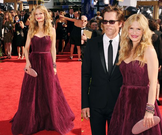
The blonde and brunette did agree on one star...Kyra Sedgwick in her plum/wine color Monique Lhuillier.
The hair, the clutch, the jewelry and obviously the dress makes her our #1 agreed upon girl!


Look at these bangles!!  This makes me smile...love, love, love!


Julia Ormond also did a great job with her accessories.  When she stepped on stage all I could focus on were these amazing cuffs!


There were many other awesome dress (Dianna Argon) and quite a few terrible choices (Rita Wilson) on the red carpet, but all in all it was a great fashion night.  Hope you enjoyed!

Friday, August 27, 2010

detailed decorating

I believe in the details.  Whether you are styling an outfit or a home the accessories will make or break it.  I love walking in a home (of flipping through a magazine) and seeing how someone has personalized their space.  To me, this is achieved with the styling of your tables and shelves.  I will admit that I have studied these pictures way too many times and reference them constantly to find inspiration for my own home. 

So here are a few of my absolute favorite table vignettes and shelf styles!

Perfect little end tables...


love it...I spy a baby foo dog


I'm really into the eclectic look of these bottles with that print,


but typically I like a console table styled with a little symmetry...


two lamps and two stools...always a recipe for success!


A very nice table top...


and another.  I know I've shown this one before, but I just can't help...I absolutely love it!


Isn't this too cute...love this little shelf!

On a larger scale...styled to perfection!


I really do draw so much inspiration from each one of these pictures. 
As you can probably tell from these images I'm not one for simplicity:)  I like excessive accessories for myself and my home...it's just more fun that way!
 Happy weekend!
~the blonde


(I apologize for not remembering the sources of these pictures...please let me know if you recognize something)
(Nate Berkus, unknown, unknown, Angie Hranowsky, The Newlywed Diaries blog, Lindsey Harper, unknown, unknown)


Thursday, August 26, 2010

a name with a face

I present to you the third installment of "iconic wallpapers: the history."  Okay, so there really isn't an iconic wallpaper series, but after this post and this one I'm starting to feel like this is turning into a habit:)

Today, we will study Fornasetti and his classic series of faces.


When I saw this wallpaper it was love at first sight, but I had no idea that it was based on a design from the infamous Italian designer.  Fornasetti produced a plate series with over 350 variations of the same face and this series was eventually recreated as wallpaper. 


love, love, love


When I asked the brunette about this wallpaper she informed me of Fornasetti and how his "face designs" are now featured on tons of home furnishing items.  She's in love with these chairs. 
(Remember, she is a trained designer with like a degree and everything so she always knows these things)


Here's a few of my favorites from his plate series...aren't they amazing?!? 
Go here to check out these plates and hundreds of other Fornasetti designs


Seriously, who wouldn't love this collection...


I feel a new obsession coming over me...


This is genius and a great alternative to the $183 plates...
This clever lady found a piece of the wallpaper and just framed the faces...super cool and cost conscience...love it!!


Fornasetti's work is truly amazing and his story is very interesting.  Seriously, it's worth visiting his website just to learn a thing or two;)
~the blonde

Wednesday, August 25, 2010

silver lining

This has been one of those weeks when I must keep telling myself that "every cloud has a silver lining," and in honor of this mantra here's a few silver pretties to brighten up your Wednesday!  Plus, who doesn't love a metallic?!?

Isn't this just a beautiful bedroom?  That stool fabric is so divine...love it!


I also love these silver Moroccan poufs in this all white living area! 
West Elm did carry these poufs, but they aren't online at the moment?!?


Love this modern silver bathroom...


and who wouldn't want to soak in this metallic dream?


Using silver as an accent can instantly add a little glam to your space!


Now that's a headboard...

Silver also looks amazing when mixed with a little color...


Love, love, love this cabinet!  It's perfectly styled and everything looks amazing against the silvery grey back drop! Isn't it gorgeous?!?


If these silver images weren't enough and you still need a little reminder...then you can always order this too cute print from here.

~the blonde


(images from Decorista, Life in the Fun Lane, Elements of Style, Decorista, Decorista, EofS, unknown)


Tuesday, August 24, 2010

And the Kitchen of the Year Goes To...

A couple weeks ago, House Beautiful revealed its "Kitchen of the Year" - a showcase kitchen designed by Jeff Lewis from Bravo's Flipping Out.  The designer proclaims he doesn't cook, but it's so obvious he knows what a great kitchen design is all about!


From the overall view, there are a few key design points that jump out at me. 

First, his "work triangle" is successful. The "work triangle" is from your refrigerator, to your sink, to your heating area (stove, oven, microwave).  I also like how the island continues almost to the refigerator, so you have a surface to set ingredients on when you pull them out.  This is a great kitchen layout.  The only thing I would personally change - it's incredibly inefficient to place your ovens next to the refrigerator.  This will result in a lot of wasted energy.  I would recommend moving the ovens to the other side of the sink (although he's the contest winner and I'm not). 

Second, as I mentioned way back in this post, wood is great for warming up a modern space.  White countertops and tile backsplashes are offset with dark wooden cabinets and shelving, and light wood floors. 

Third, I love that the wine is kept handy - great wine rack!  :o)


I love the open shelving, and the great sink faucet.  I think it's a great idea to put herbs on the shelf - but a window would help.  I have to keep reminding myself this is not a real kitchen, it's just an installation.


I didn't notice from other shots, but the tabletop extends onto the countertop.  I'm not sure the purpose of this - I guess it's cool looking, but all the space underneath is wasted...


I love the open trusses, this chandelier is amazing - the blonde will love it - the undercounter lights, the wine glasses (how handy the bar is right by the table), this table is just amazing - it looks like really beat-up wood that's been polished and varnished - completely my taste.

My only complaint, is the table is a little high and the stools look uncomfortable.  I would personally nix the table extending on top of the counter and lower it a bit.


I feel like I've completely bashed this kitchen and I didn't intend to at all - I really do love it - there are only about 3 things I would "tweak" ;o) 

~ the Brunette